

Redesigning a 10 yr old application used by the Film/VFX industries for Autodesk

Project Summary
Shotgun was a 10 year old SaaS product with over 50,000 customers. While the platform was best in breed, they were
seeing upstart competitors start competing on new features and a better UI. Shotgun revolutionized the way media and entertainment professionals collaborated on projects, winning multiple industry awards including a technical Emmy.
My team was tasked with the ambitious
goal of reinventing Shotgun's core platform, aiming to optimize the onboarding experience for new users, as well as removing the complexity for existing users.
Project Details
Role :
Product Design Lead
User Research Lead
Design Systems Lead
Product Designer
Duration :
1 year
Tools :
Miro, Figma
Deliverables :
Challenges
Complexity
User Experience
The platform was initially created 10 yrs ago and was showing its age. Originally built to be utilized by large film studios, it hadn’t changed to provide tools for smaller and more nimble studios like Netflix and streamers.
Shotgun's platform of products had been steadily increasing, causing their experience to become sluggish and difficult for new users. This led to a massive amount of "design debt," which negatively impacted the onboarding experience; consequently, prospective customers were left confused and frustrated as they struggled through an overwhelming setup process that required too many steps. As existing users found themselves spending excessive amounts of time configuring projects in Shotgun, it was perceived only beneficial for large-scale operations rather than smaller ones - we needed to make changes fast!
Results
50% increase in successful onboarding
86% positive increase in UI CSAT
124% decrease in time setup
Process
The framework we used to conduct the redesign of Shotgun’s core platform was a design thinking process, slightly modified for Lean UX.
EMPATHIZE
DEFINE
IDEATE
PROTOTYPE
PROTOTYPE
TEST
Key
Team Members
Product
Design Lead
(me)
User
Researchers
Product
Designers
Design System Designers
Research
We started the redesign process like any other project, and conducted an extensive amount of user research, from 1-on-1 interviews to site visits, and contextual inquiry.
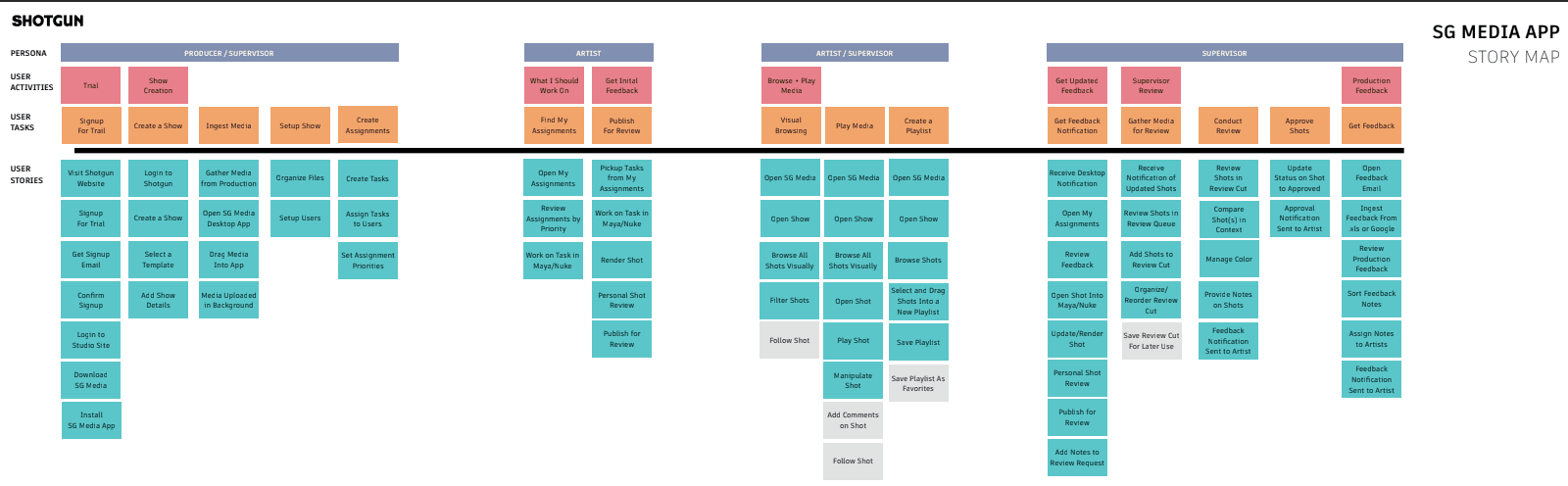
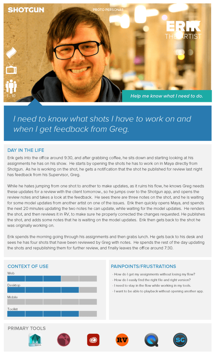
Multiple Personas = Multiple Experiences
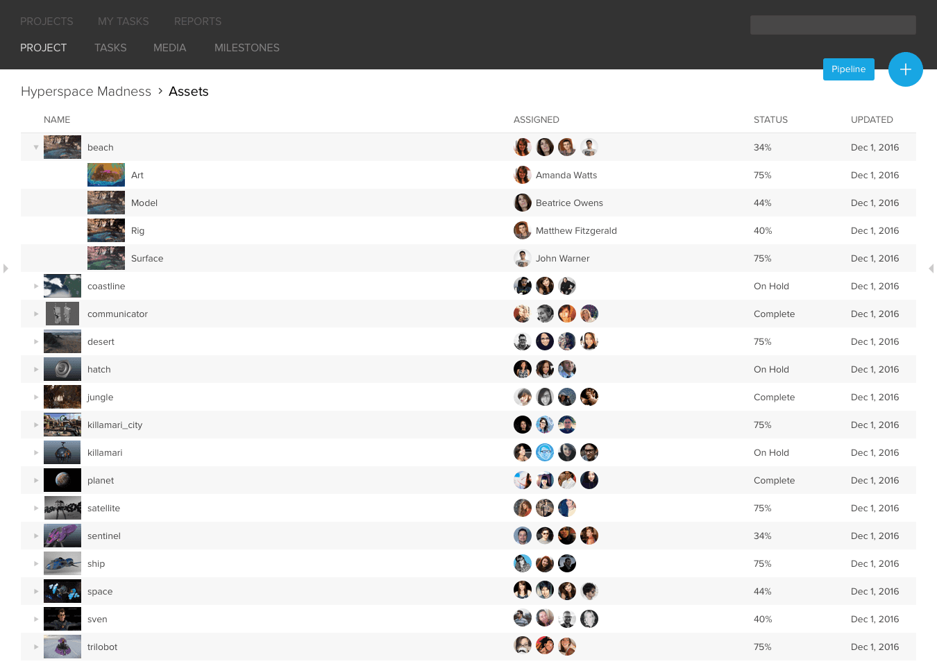
To ensure all Shotgun users can get the most out of our platform, we conducted extensive research to better understand their individual workflows and needs. From big studios to small FX houses, dozens of interviews enabled us to craft detailed personas enabling us to tailor experiences that feel like part of a unified whole while meeting each user's unique requirements.
With so many different users, the complexity and size of the platform, we realized we had to tackle the redesign in stages, and only update features being used by a specific persona. We didn’t want to have a completely “Frankenstein” application while the redesign was happening over several quarters, especially with such a vocal and rabid user base.
After exploring different studios and workflows, we uncovered key insights about the needs of our target personas:
Design
My team was tasked with the ambitious goal of reinventing Shotgun's core platform, aiming to optimize the onboarding experience for new users, as well as removing the complexity for existing users. The obstacles we faced included feature-driven design decisions, information density, hierarchy issues and a lack of consistent UI conventions, which all impacted our ability to create a unified visual language.
Over a one-year span, we successfully redesigned how projects were created, organized and assigned through an improved user experience that revolutionized Shotgun as both a platform and ecosystem at large.
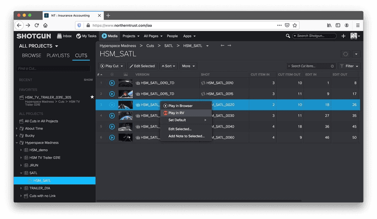
Our first sub-project was how users were introduced to Shotgun for the first time and asked to create a project from scratch.
Through research, we identified several opportunities for improvement. We concepted, wireframed, and then developed an InVision prototype focused on the workflow of setting up a project with a simplified experience.
Our efforts yielded great insights which would be imperative for making improvements in the platform’s product roadmap moving forward.
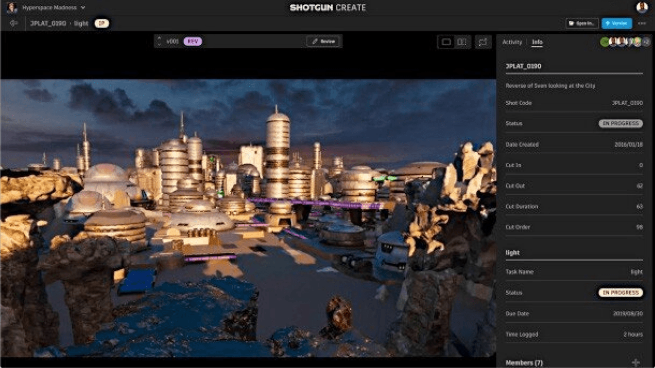
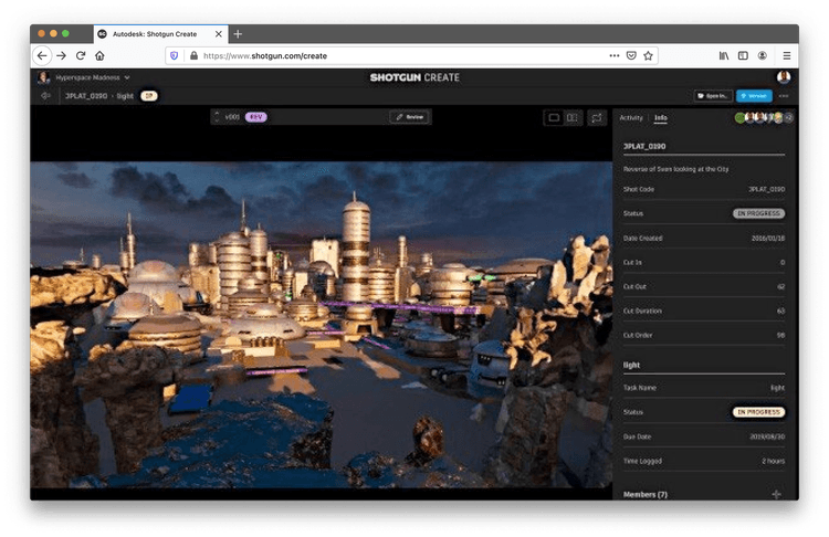
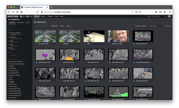
We were able to gain tremendous insights from our users, particularly regarding the new UI's cleanliness and linear workflow. Notably, they raved about the media import flows and enhanced playback abilities throughout Shotgun screens.
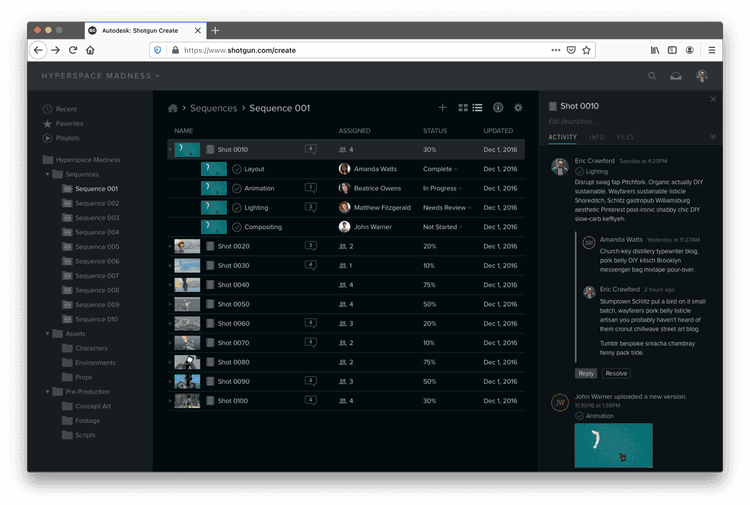
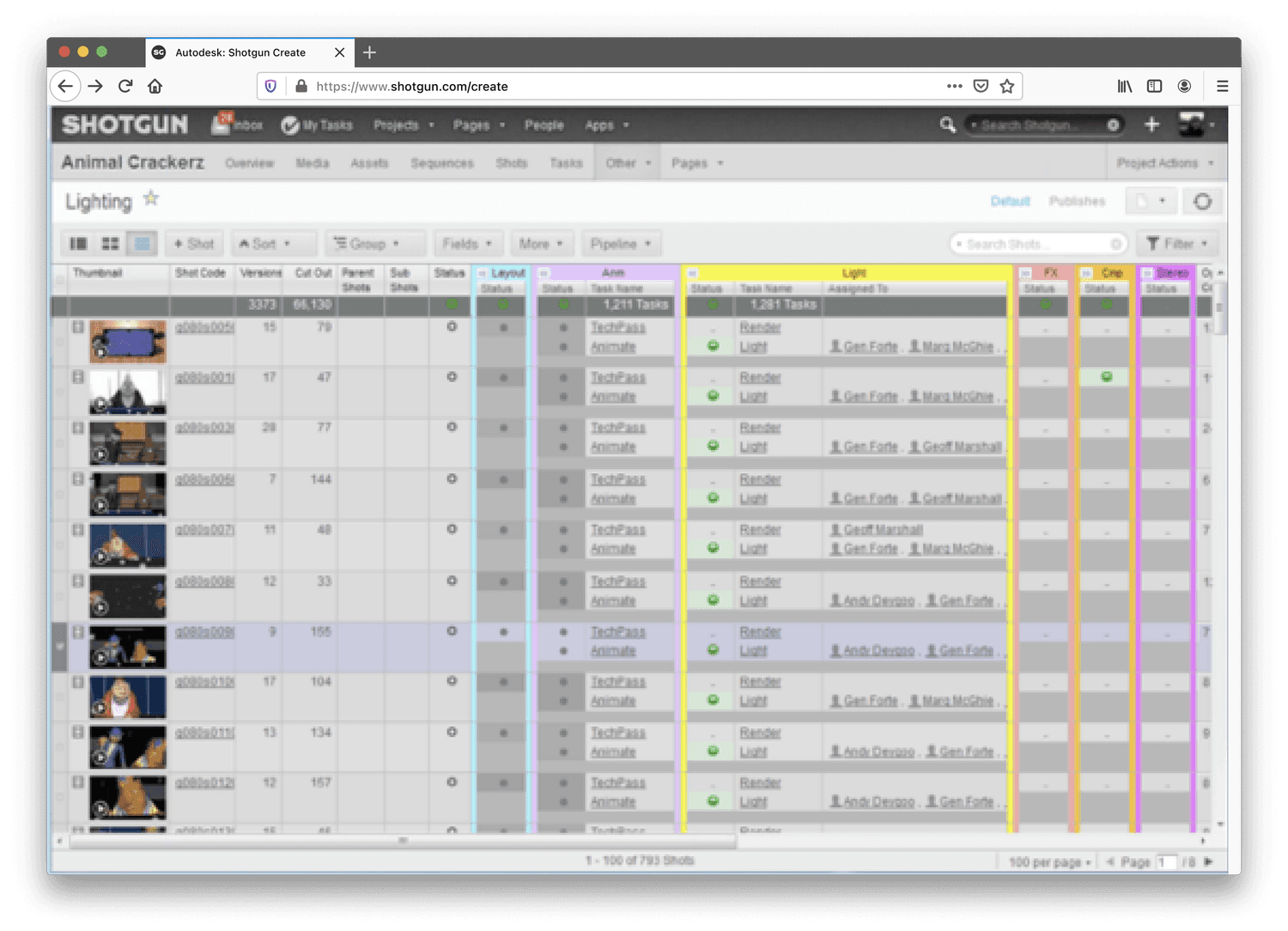
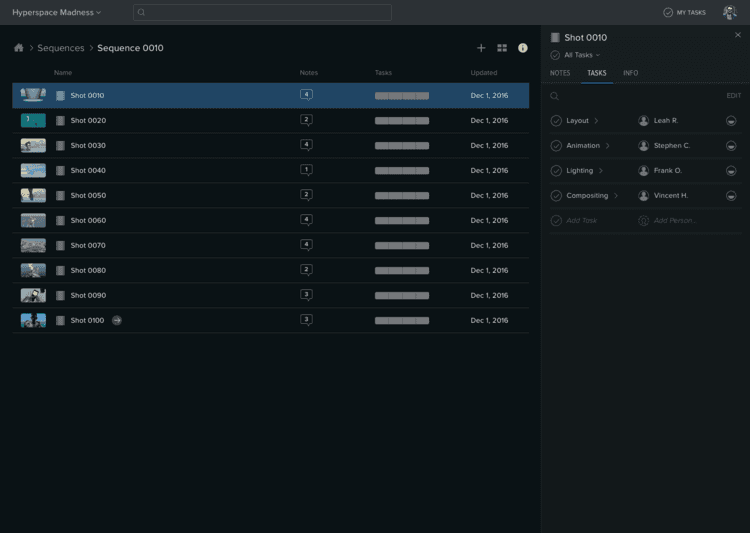
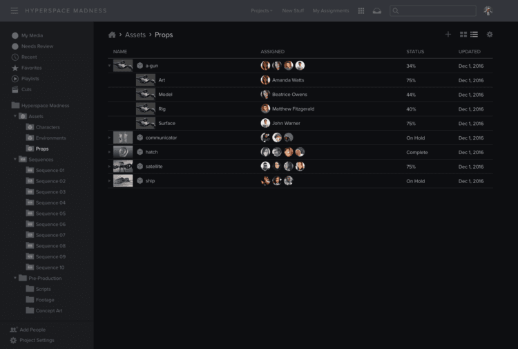
Users were able to easily review their entire project/pipeline at a glance with the ability to zoom in and out on specific sections as desired, quickly assess their progress by seeing how many items are ongoing, needing reviews, etc., all without losing sight of important details.
Notice a theme yet?
Users were craving a more direct and more consistent experience.
Supervisors were looking for a single view that provided an overview of the necessary information, without overwhelming them with too much detail. Although they appreciated having more detailed insight easily accessible at their fingertips through clicking on whatever was needed to get further details.
To optimize our user experience, we implemented Shotgun Design System and offered the ability to switch themes. We modernized the look by offering a dark UI theme for Supervisors/Artists and light version for Coordinators – giving customers an aesthetic that was similar across their other applications.
We took the existing Shotgun and all of the redesign work we’d done in the first half of the year and tripled the team size, then split it in two, with one group working on the platform and the other working on the platform design system.
The Shotgun team set out on a mission to improve the UX for newcomers and existing users alike.
Our ultimate objective? To make life easier for everyone, but with more of an emphasis placed on our new users. This challenging endeavor was divided into two main parts:
Project setup, organization, and tracking
How might we improve the UX around creating new projects, getting your stuff in and organized, and getting it assigned? Our goal was to design the best possible experience for doing this in 5 minutes or less. At this stage, we kept it pretty open. We played with changing existing functionality and adding new features. We tried many scenarios so we could prove we picked the best one.
Global and project navigation
Once we determined the best possible project setup workflow, how does that fit in our existing navigation model? What needs to change? How is navigation impacting new users getting started and existing users finding their way to features they need to use daily?
Every day, our goal was to improve the existing product, but not at the expense of current user retention (if existing users stop using the app because of changes we made, that isn’t good).
Back to Autodesk
Home
Work
About
ideas
Contact